Designing a mobile app is a multi-faceted process that requires careful attention to both form and function. The Human Interface Guidelines (HIG) for Apple's iOS platform provide a comprehensive set of design principles and best practices to help developers create apps that are easy to use, intuitive, and visually appealing. Whether you are a seasoned developer or new to the iOS ecosystem, these guidelines are an essential resource for creating successful iOS apps.
Designing for the User
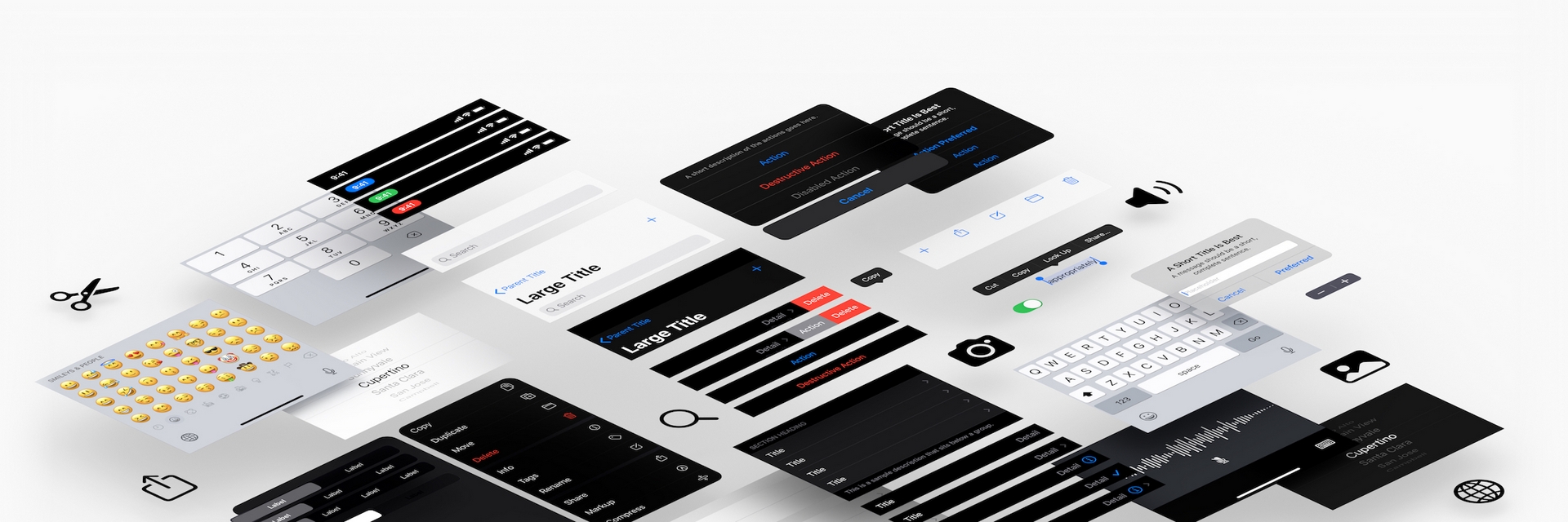
At the heart of the HIG is a focus on designing for the user. The guidelines encourage developers to think carefully about how users interact with their apps, and to create interfaces that are both easy to use and aesthetically pleasing. To achieve this, the HIG offers a variety of best practices and design principles that cover everything from typography and color to layout and navigation.
Typography
The typography of an app can greatly impact how users perceive and interact with it. Apple recommends using a legible and consistent font that is appropriate for the app's purpose. This includes using sans-serif fonts for body text, and serif fonts for titles and headings. Developers should also pay attention to the size and spacing of text, making sure that it is easy to read and not too crowded.
Color
Color is another important aspect of app design, as it can help convey meaning and create a cohesive visual style. Apple recommends using a limited color palette, with no more than three or four primary colors, and avoiding overly bright or saturated colors. Developers should also consider how color is used to indicate status or communicate information, such as using green to indicate success and red to indicate errors.
Layout
The layout of an app plays a crucial role in how users interact with it. Apple recommends using a consistent layout throughout the app, with a clear hierarchy of information and intuitive navigation. This includes using a grid-based layout to ensure that elements are aligned and properly spaced. Developers should also consider how the layout adapts to different screen sizes and orientations, making sure that the app is usable on both phones and tablets.
Navigation
Effective navigation is key to creating an app that is easy to use and navigate. Apple recommends using a simple and consistent navigation structure, with clear labels and intuitive gestures. This includes using familiar navigation patterns, such as a tab bar or a side menu, and avoiding overly complex or nested navigation structures. Developers should also consider how users can easily access important features or information, such as using a search bar or a quick action menu.
Accessibility
In addition to designing for the user, the HIG also emphasizes the importance of accessibility. This includes designing for users with disabilities, such as visual impairments or hearing loss, and ensuring that the app is usable by all users regardless of their abilities. Apple provides a range of accessibility features, such as VoiceOver and Dynamic Type, that developers can use to make their apps more accessible.
Conclusion
Designing a successful iOS app requires a deep understanding of user needs and behaviors, as well as a mastery of the design principles and best practices outlined in the HIG. By focusing on the user and creating interfaces that are easy to use and visually appealing, developers can create apps that are not only functional but also enjoyable to use. Whether you are a seasoned developer or new to the iOS ecosystem, the HIG is an invaluable resource for creating high-quality iOS apps.